Web Design Guide
Homepage Sections
Every Website Needs
Your homepage is your digital storefront, elevator pitch, and sales representative all in one. Within seconds, visitors decide whether to stay or leave. That means every section must be intentional, strategic, and conversion-focused.In this in-depth guide, we’ll explore the essential homepage sections every website needs, why they matter, and how to design them effectively.
The Hero Section is the first thing visitors see when they land on your website. It appears at the top of the homepage and plays a crucial role in deciding whether users stay or leave. Within a few seconds, this section must clearly communicate what you offer, who it’s for, and why it matters.A strong hero section builds clarity, creates interest, and directs visitors toward a specific action. If it’s confusing or overloaded with information, users are unlikely to scroll further.

Hero Section
Key Elements of a Strong Hero Section
Clear, Benefit-Driven Headline
Your headline should focus on the main result users
will get.
Example:
“Build Professional Websites Without Writing Code”
Supporting Subheadline
The subheadline briefly explains how the benefit is delivered.
Example:
“Create, customize, and launch stunning websites in minutes using our easy drag-and-drop builder.”
Primary Call-to-Action (CTA)
Your CTA guides users toward the next step.
Examples:
-: Start Free Trial
-: Get Started Today
-: Book a Demo
Supporting Visual
Include a product mockup, illustration, or relevant image to make the section more engaging and professional.
Tip
Use a high-quality image, or relevant visual that reinforces your message.
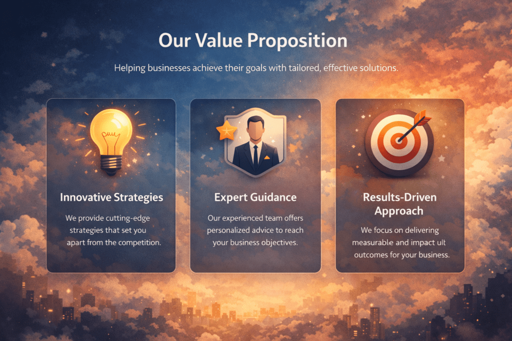
The Value Proposition Section comes right after the hero section. Once you’ve captured attention, this section explains why visitors should choose you. It highlights your core benefits in a clear, scannable format.
Users typically don’t read long paragraphs — they scan for key points. That’s why this section should be simple, structured, and outcome-focused.
A strong value proposition section usually includes :
- 3 to 4 key benefits
- Short, clear descriptions
- Simple icons or visuals
- Clean card or column layout
Value proposition section
Value Proposition Examples
Weak vs. Strong Headline Examples
❌ Weak example:
“Advanced Automation Tools”
✅ Stronger example:
“Save 10+ Hours Every Week with Smart Automation”
Each benefit should clearly answer the question: What’s in it for me?
Save Time
Automate repetitive tasks and focus on what matters.
Increase Revenue
Optimize conversions with built-in analytics.
Secure & Reliable
Enterprise-level security with 99.9% uptime.
The Social Proof Section builds trust and credibility by showing that others have used and benefited from your product or service. Visitors are more likely to engage when they see real results from real people.
Key elements include:
- Customer testimonials
- Star ratings or reviews
- Media mentions
- Client logos
“We increased conversions by 38% in three months.” — Marketing Director, SaaS Company

Social Proof Section
- Use a clean card or grid layout
- Include short descriptions and clear headings
- Add visuals like product images or icons
- Link to detailed product or service pages
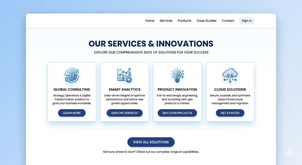
Products or Services Overview
Example Cards
This section bridges awareness to action by clearly showing what visitors can gain from your offerings.
Website Builder
Drag-and-drop editor to create professional sites
Marketing Tools
Automate campaigns and track results
Analytics Dashboard
Monitor performance in real time
Keep it short and clear:
- Sign Up – Create an account in seconds.
- Customize – Set up your preferences and tools.
- Launch & Grow – Start using the product and see results.
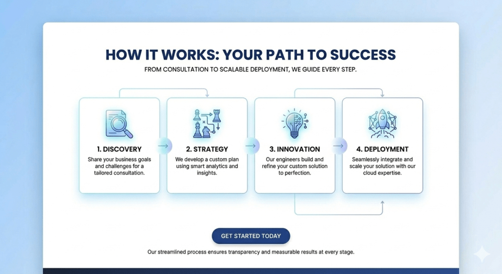
How it works Section
Include:
- Who you are
- Why you started
- Your mission or vision
- A photo of the team or founder(Optional, trustworthy)
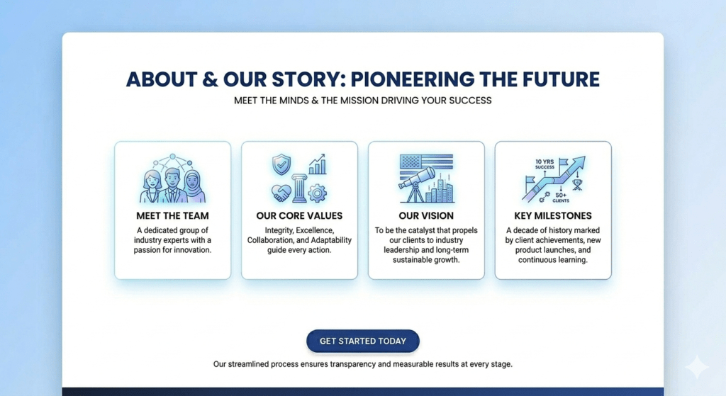
About or Story Section
Tips for an effective CTA
- Make it bold and visually prominent
- Reinforce the value of taking action
- Keep it simple with one primary CTA
- Use action-oriented text, e.g., “Start Free Trial” or “Get Started Today”
This section should stand out on the page and be easy for users to interact with, especially on mobile devices.
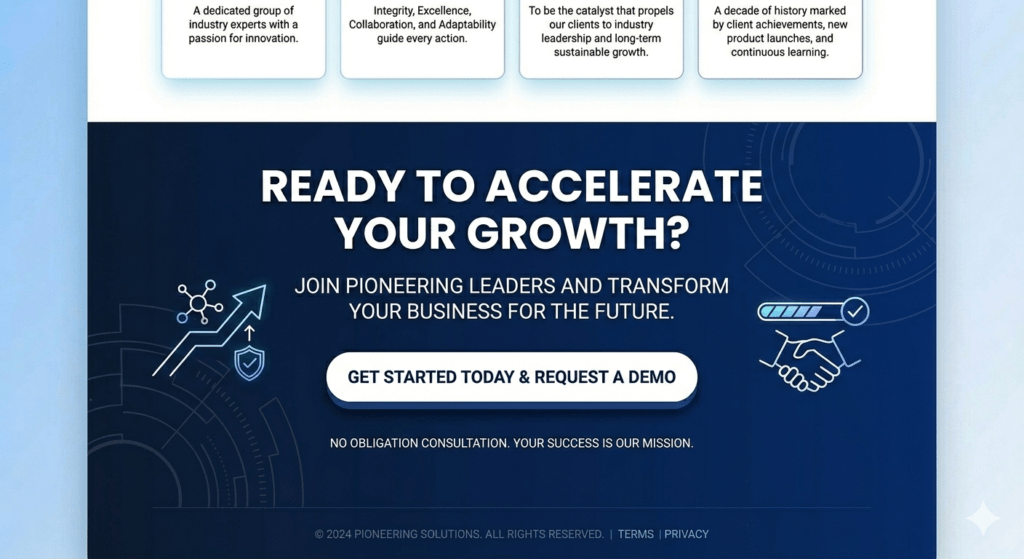
Call-to-Action (CTA) Section
Such as:
- Pricing or subscription details
- Refund or cancellation policies
- Setup or delivery process
- Customer support availability
Using an accordion or collapsible design keeps it clean and easy to scan, making information accessible without overwhelming the page.
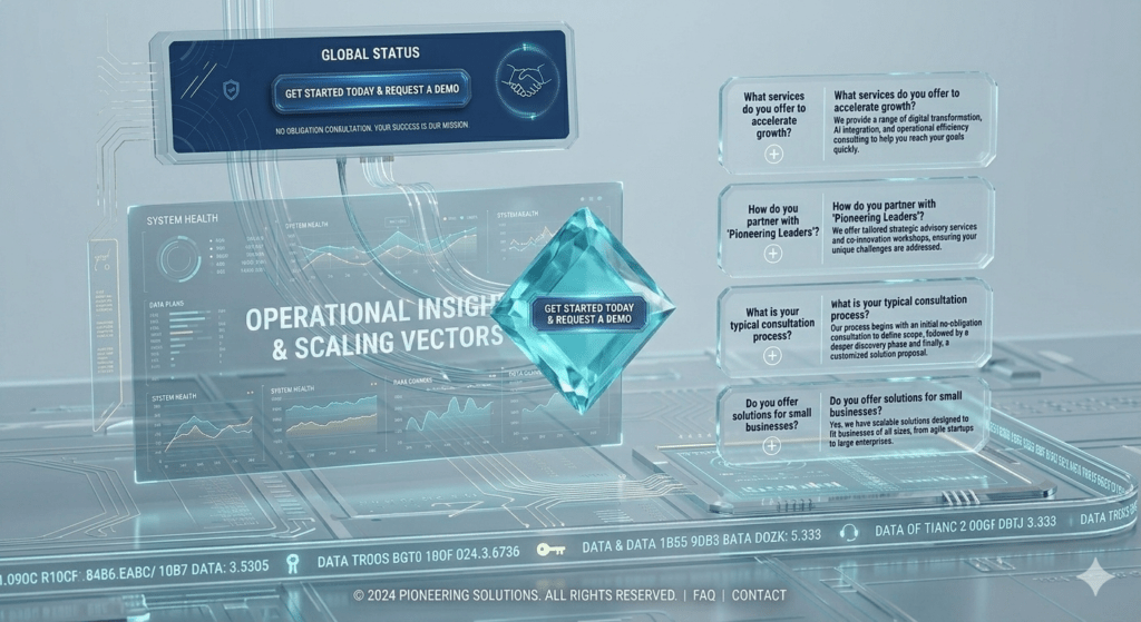
FAQ Section
Key elements to include:
- Navigation links to important pages
- Contact information (email, phone, address)
- Social media icons
- Legal pages like Privacy Policy and Terms & Conditions
A well-designed footer ensures visitors can find what they need without scrolling back up and adds a professional, trustworthy finish to your website.
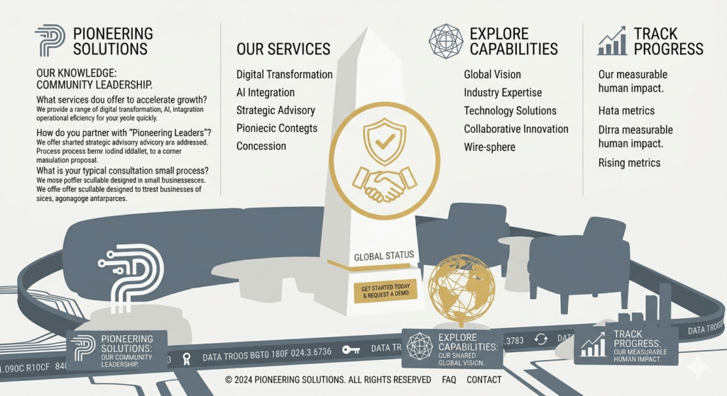
Footer Section
Conclusion
- Captures attention instantly
- Communicates value clearly
- Builds trust through social proof and story
- Reduces friction with clear steps and FAQs
- Encourages action with strong CTAs